DISTILLERY DISTRICT DIRECTORY
2022
WAYFINDING | INFORMATION DESIGN
A seamlessly integrated Distillery District directory using intuitive symbols and a custom system for universal, effortless navigation.
Tools
Adobe Illustrator
Adobe Photoshop
Timeline
1 Month
overview
This project aims to design a directory for the Distillery District that seamlessly integrates with its unique aesthetic and surroundings. The directory will feature a custom organizational system enhanced by intuitive, universally recognizable symbols to improve accessibility and ease of navigation for all visitors. At its core, the project explores how we might create a wayfinding solution that both complements the character of the space and prioritizes inclusive design.
How might we... design a directory for the Distillery District that fits the environment's aesthetic while making considerations for accessibility.
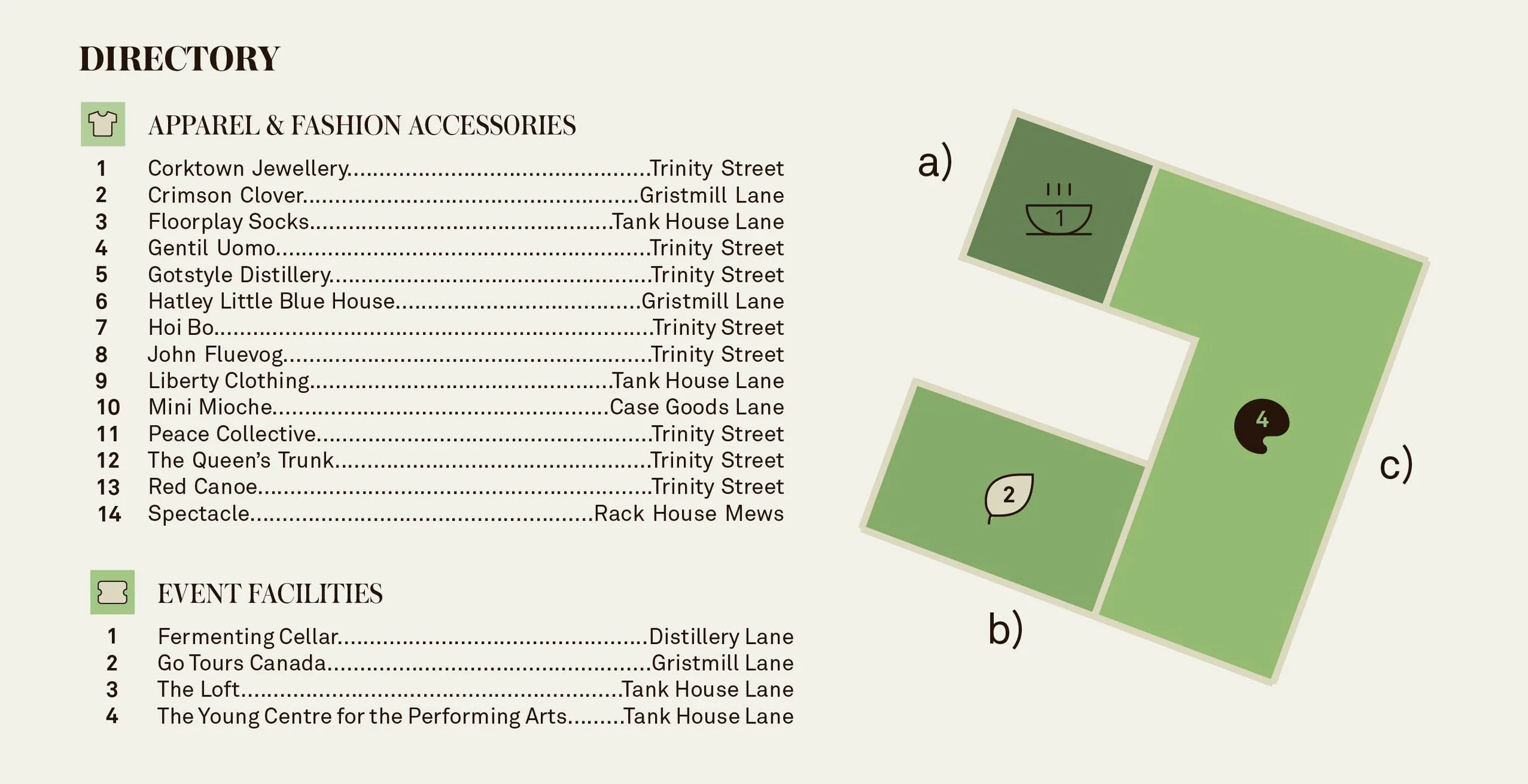
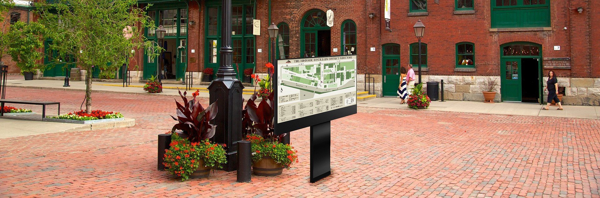
THE DIRECTORY
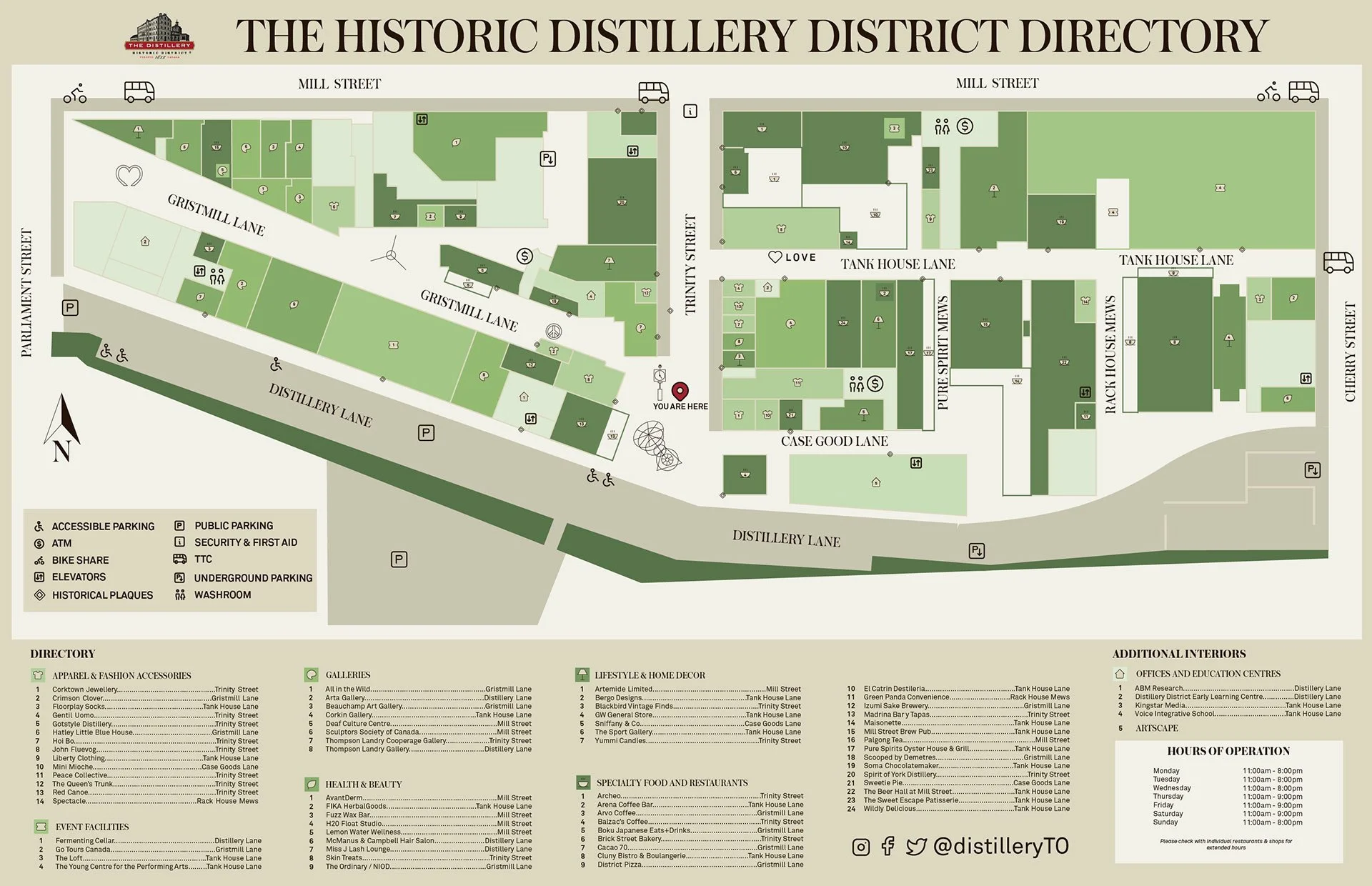
RESEARCH & PROCESS
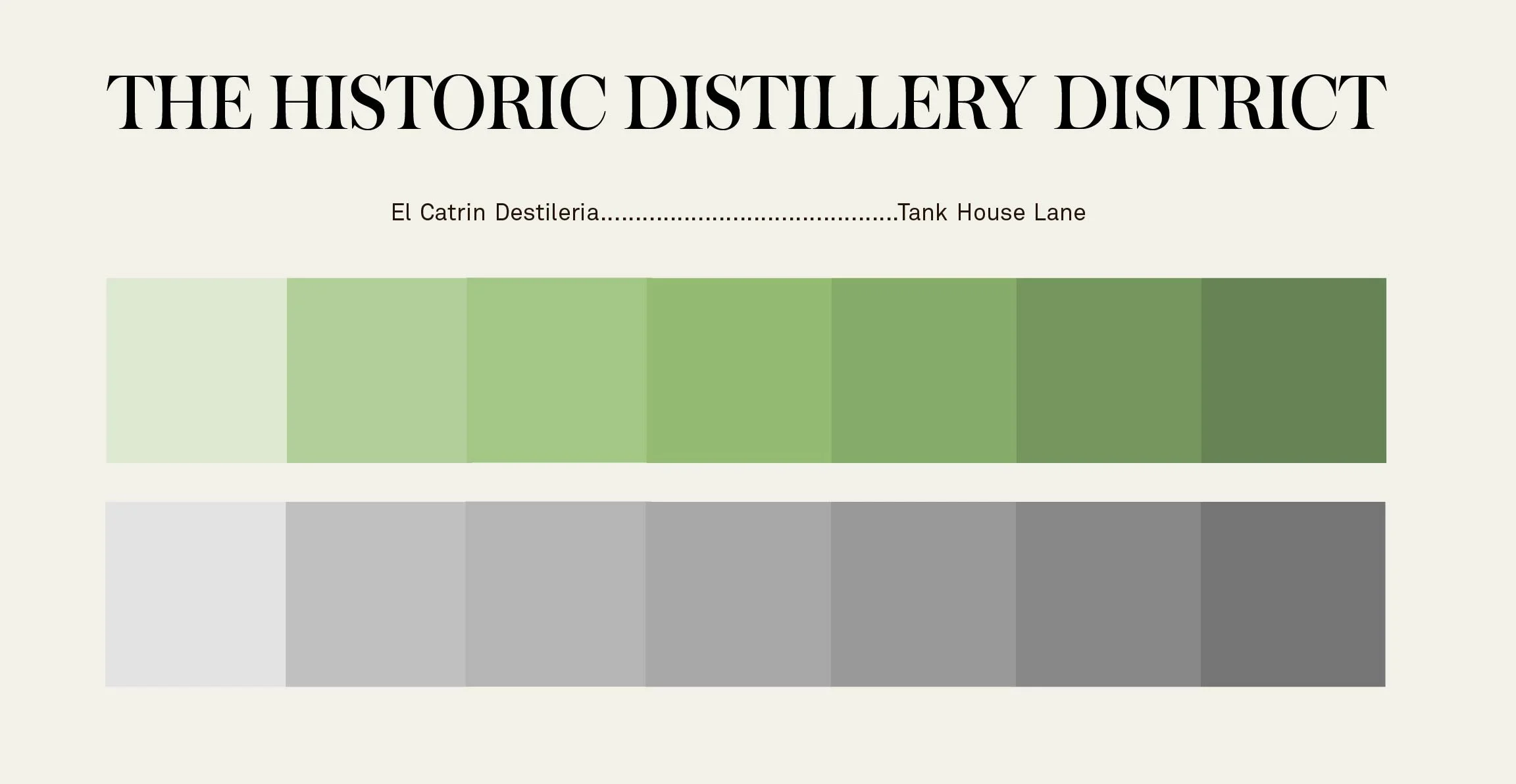
colours and typography
My key design priorities were environmental harmony, accessibility, and legibility. I chose a muted, monochromatic color palette with high tonal contrast to support colorblind users, and selected typefaces that balanced historical character with readability—ensuring the directory fits the space while remaining clear and easy to navigate.
INFORMATION DESIGN
To improve accessibility, I moved away from traditional alphanumeric systems used in past Distillery District directories, opting instead for a custom system combining numbers with clear, category-specific icons. While color was used to guide the eye, the primarily monochromatic palette kept visual emphasis on structure and legibility. Categories like Apparel use icons (e.g. a shirt) paired with numbered locations, and all listings are alphabetized with street references for easier navigation. To ensure clarity, I tested multiple symbol designs with users, with the majority favoring the version that featured a consistent, neutral background.